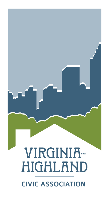
A New Look for the VHCA
To say that the staff at Tailfin Marketing (located on Virginia Ave. near Briarcliff) has a passion for all things ‘Virginia-Highland’ would be an understatement. It’s unclear whether that passion is something Tailfin’s co-owner and VHCA board member Lola Carlisle – and her partner Greg Abel – screen job applicants for, or whether it’s something ingrained during the Tailfin Kool-Aid drinking process (and, believe me, there’s Kool-Aid in that office space somewhere, along with every other tasty treat you can think of). Suffice to say the staff is always eager to lend their skills to any VaHi-related project (to the extent Lola will let them since all the work her staff does for the VHCA is pro-bono and Lola is in business to make a profit).
So, it’s not surprising that a couple of Tailfin designers – Samantha Schneider and Ashley McAlpin – asked (pretty much begged) to take a whack at working up an updated VHCA logo. As a writing/photography/editing kind of guy, the logo we already had worked OK for me. It did a decent job of communicating what, to me, was the essence of VaHi: that we are a neighborhood of homes, surrounded by trees that we value (and everything else healthy that implies), surrounded again by a city that – whether we love it or not – isn’t going anywhere. But last year the marketing folks said it was time for a change – what else would you expect from marketing folks? – and so the process of searching for a new logo began.
With this newsletter we unveil the fruit of our (their) labors. We hope you like it. We’ve gone through numerous iterations of the logo, digitally placing it everywhere you could expect a VHCA logo to be placed – including the iconic sign at the triangle island at Virginia and N. Highland. The VHCA board approved this new logo last October and we’ve been sorting through applying it to all our communication pieces ever since. Look for applications of the new logo to vahi.org and other places over the coming weeks as Ida Centner and Mary Buckley Johnson – our much-appreciated VHCA volunteer website and newsletter designers/developers – continue to update graphics and programming.
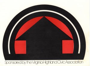
If you’re interested in historical perspective, images accompanying this article show prior iterations of the logo over the years. Mary Drolet created the first VHCA logo back in 1972, and she created the logo for the first Virginia-Highland Tour of Homes. The TOH logo was particularly interesting in that the goal was to promote interest in revitalizing homes in Virginia-Highland. The neighborhood was in transition then from having been run down after the suburban exodus, and the Tour promoted pride in ownership and rebuilding the community.
The logo most are familiar with is the arched green and black one featured on the sign at the triangle at Virginia and N. Highland. The designers of the new logo did their best to create an evolution of the original logo as opposed to a complete change. In the new logo, the house – similar to Mary Drolet’s house in the first Tour logo – is used not only to represent our amazing homes but also serves as an upward arrow. Trees are such an intrinsically valuable part of our neighborhood and VaHi wouldn’t be VaHi without them so they are featured prominently in the logo, along with our proximity to the city. The colors were adjusted a bit to be more muted yet still bright, and we used a very similar font to maintain continuity. We look forward to applying the new logo to all sorts of new pieces from house flags (look out, Inman Park butterfly) to car tags to t-shirts. We hope to share some of these fun new items with you at Summerfest.
And yes…we will be updating the sign at Virginia and N. Highland at some point in the near future.
On behalf of Jack White and the rest of the board, I’d like to thank Lola, Ashley, Samantha, Ida and Mary for their invaluable contribution to the creation and distribution of this new logo and identity for the VHCA.
– John Becker, VHCA Communications Chair
